2025 Color Trends Revealed: 7 Paint Colors That Will Transform Your Vancouver Office Space
(https://cdn.marblism.com/T7R2WfcqVgQ.webp)
The 2025 color palette is here, and it's bringing some serious transformation potential to Vancouver office spaces. Major paint manufacturers have spoken: Sherwin-Williams crowned Quietude as their Color of the Year, while Benjamin Moore chose Cinnamon Slate. These selections signal a clear shift toward nature-inspired hues that balance productivity with well-being.
Vancouver businesses are catching on fast. The trend moves away from stark whites and sterile grays toward colors that actually make employees want to spend time at the office. We've identified seven standout colors that will completely reshape how your workspace feels and functions.
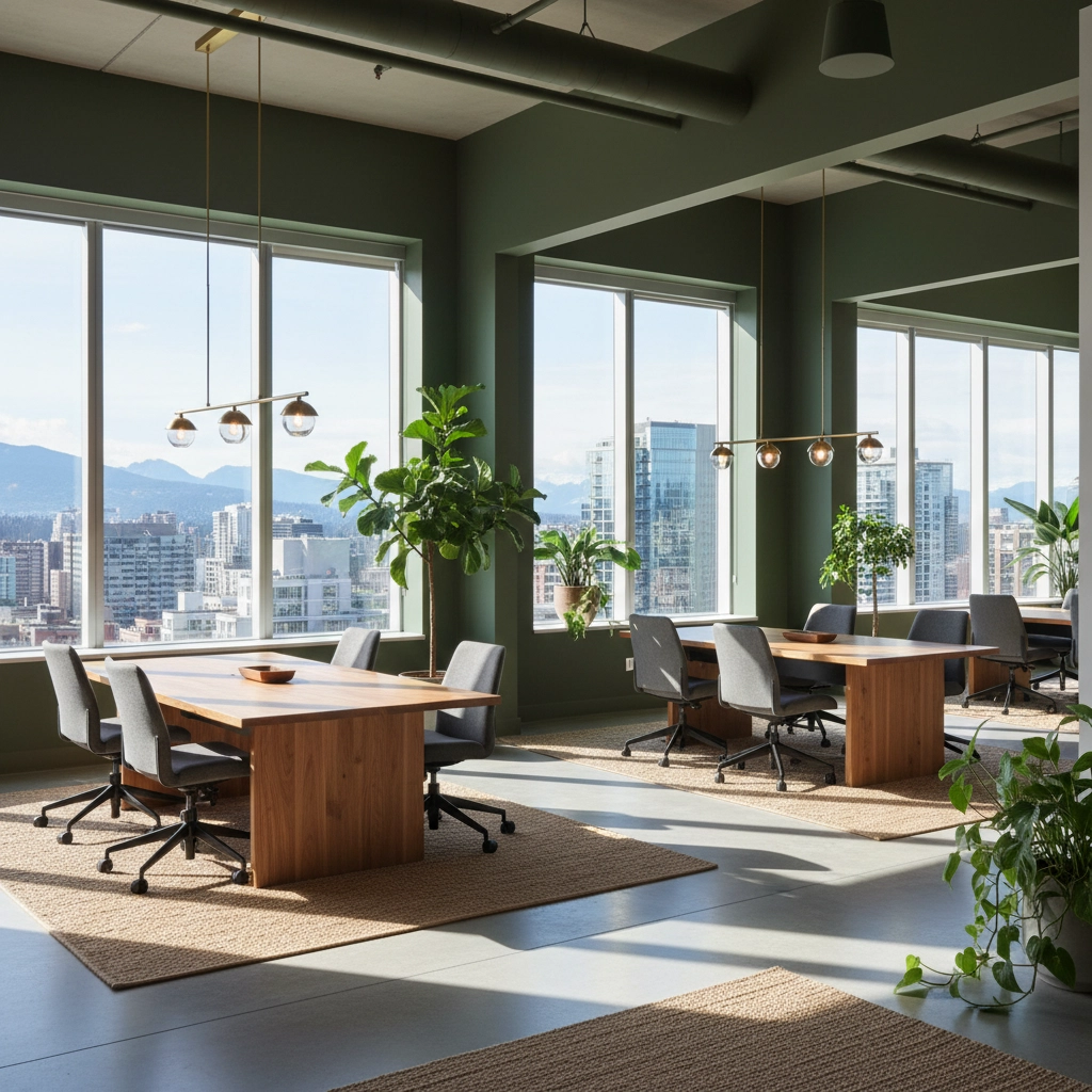
## The Green Revolution: Sage and Olive Take Center Stage
**Soft Sage Green** leads the charge as 2025's most versatile office color. This isn't your grandmother's mint green: it's sophisticated, calming, and surprisingly energizing. Sage works beautifully in Vancouver's natural light conditions, complementing the city's lush outdoor environment.
The science backs this up. Green hues reduce eye strain and promote focus, making them perfect for spaces where people spend long hours at computers. Sage green also plays well with both warm and cool accent colors, giving you flexibility as your brand evolves.
**Rich Olive Green** offers a deeper, more dramatic alternative. This earthy tone brings gravitas to executive offices and conference rooms. It's the kind of color that makes clients take notice: sophisticated without being overwhelming. Olive green pairs exceptionally well with natural wood finishes and brass fixtures, creating that high-end feel Vancouver businesses are after.
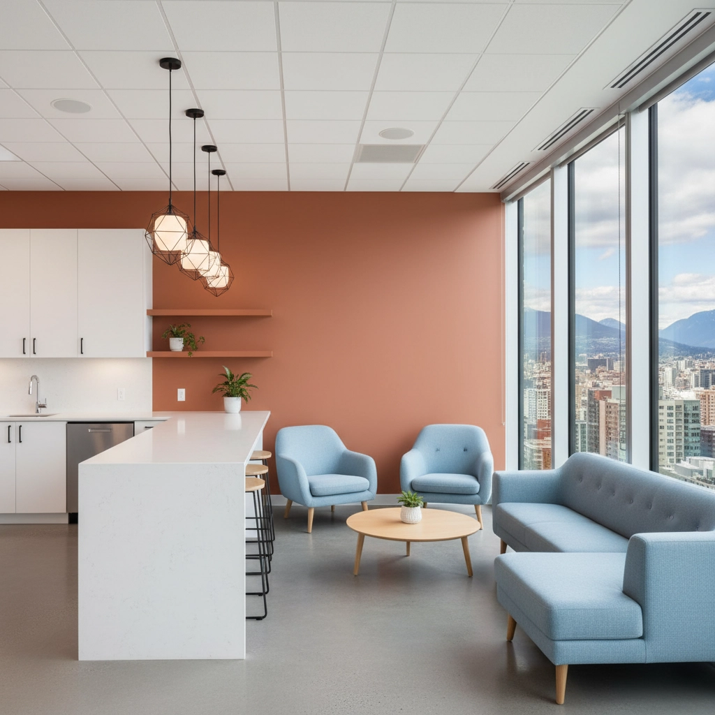
## Warm Neutrals That Actually Have Personality
**Warm Terracotta** might surprise you as an office color, but it's exactly what 2025 is all about. This earthy orange-brown creates an inviting atmosphere that's perfect for collaborative spaces and break rooms. Terracotta works especially well in Vancouver offices that want to stand out from the sea of generic corporate spaces.
The color connects directly to Benjamin Moore's Cinnamon Slate trend: those heathered plum and brown undertones that add depth without distraction. Use terracotta as an accent wall or in furniture pieces to warm up cooler color schemes.
**Charcoal Gray** remains the dependable foundation for professional spaces. But 2025's charcoal isn't flat or boring: it has subtle undertones that shift with the light. This creates visual interest while maintaining the authority and focus that executive spaces require. Charcoal works particularly well in Vancouver's climate, providing a sophisticated contrast to the natural light filtering through office windows.
## Blues That Boost Productivity
**Classic Navy Blue** never goes out of style, and 2025 proves why. This deep, rich blue creates an atmosphere of reliability and trust: exactly what you want clients to feel when they walk into your office. Navy works beautifully with Vancouver's harbor views and creates a sense of continuity with the city's maritime character.
The psychology is solid too. Blue promotes clear thinking and decision-making, making it ideal for spaces where important business happens. Navy blue also photographs well for virtual meetings, giving your team a professional backdrop that translates perfectly on camera.
**Soft Sky Blue** brings a lighter energy that's perfect for creative spaces and break areas. This isn't baby blue: it's a sophisticated shade that promotes openness and communication. Sky blue works especially well in offices with limited natural light, creating the illusion of brightness and space.
## The Unexpected Power Player: Muted Blush Pink
**Muted Blush Pink** represents 2025's boldest office trend. Before you dismiss pink in a professional setting, consider this: major tech companies and design firms are already using sophisticated blush tones to create welcoming, inclusive environments.
The key is in the execution. Muted blush works best as an accent color in meeting rooms, phone booths, or wellness spaces. It humanizes corporate environments and signals that your company values both professionalism and approachability.
## Making It Work in Vancouver Office Spaces
Vancouver's unique lighting conditions make these color choices particularly effective. The city's abundant natural light during summer months allows for deeper, richer colors that might feel overwhelming in darker climates. During winter's shorter days, these warm and sage tones provide the visual warmth that artificial lighting often lacks.
Consider your office's orientation when choosing from these seven colors. South-facing spaces can handle the deeper olives and navy blues, while north-facing offices benefit from the lighter sages and sky blues. East and west exposures work beautifully with terracotta and blush accents that change character throughout the day.
## Practical Application Tips
The most successful office color transformations don't happen all at once. Start with one accent wall in a high-impact area: your reception space or main conference room. This lets you test how the color feels and functions before committing to a full-space application.
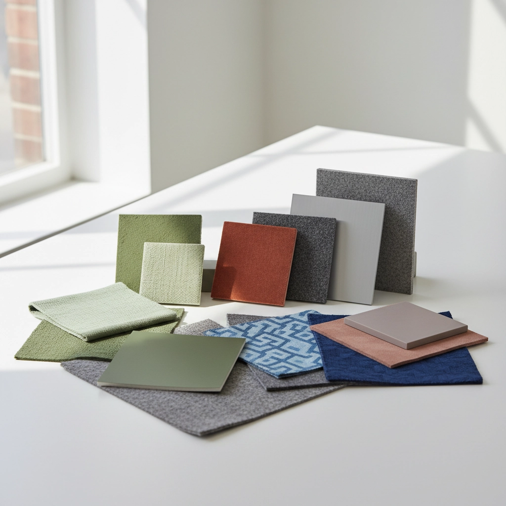
These seven colors work exceptionally well together, allowing you to create a cohesive color story throughout your office. Pair sage green with charcoal gray for a sophisticated foundation. Add terracotta accents for warmth. Use navy blue in formal spaces and sky blue in casual areas.
Consider the 60-30-10 rule: 60% neutral (charcoal or sage), 30% secondary color (navy or olive), and 10% accent (terracotta or blush). This creates visual balance while allowing personality to shine through.
## The Business Case for Bold Color Choices
These aren't just aesthetic decisions: they're strategic business moves. Companies that invest in thoughtful workplace design see measurable improvements in employee satisfaction and client perception. The right colors create environments where people perform better and feel more connected to their work.
Vancouver's competitive business landscape demands offices that stand out. Generic beige walls and corporate gray don't cut it anymore. These seven colors give you the tools to create a workspace that reflects your company's personality while maintaining professional credibility.
The 2025 color trends offer Vancouver businesses an opportunity to transform their office spaces into environments that truly work: for productivity, for culture, and for success. Whether you choose the calming influence of sage green or the bold statement of muted blush pink, these colors will help your office space evolve with the times while maintaining the professionalism your business demands.
Ready to explore how these transformative colors could work in your Vancouver office space? [Olympic Painting](https://www.olympic-painting.com) specializes in helping businesses create environments that inspire success through thoughtful color application.